Based on the main drop-off points, I developed the site-map to better visualize how the three parts are connected.
1
Ordering
- Users explore locations to choose their specific order location.
- This feature is connected to the "Explore Locations" functionality.
2
Account Information
- After creating orders, users access their account information.
- They can choose or add payment and vehicle information.
- This feature is connected to the order creation process.
3
Delivery
- If users select delivery, they need to choose from their saved addresses.
- This feature is connected to the order creation process.
DESIGN EXPLORATIONS
The Ordering Flow
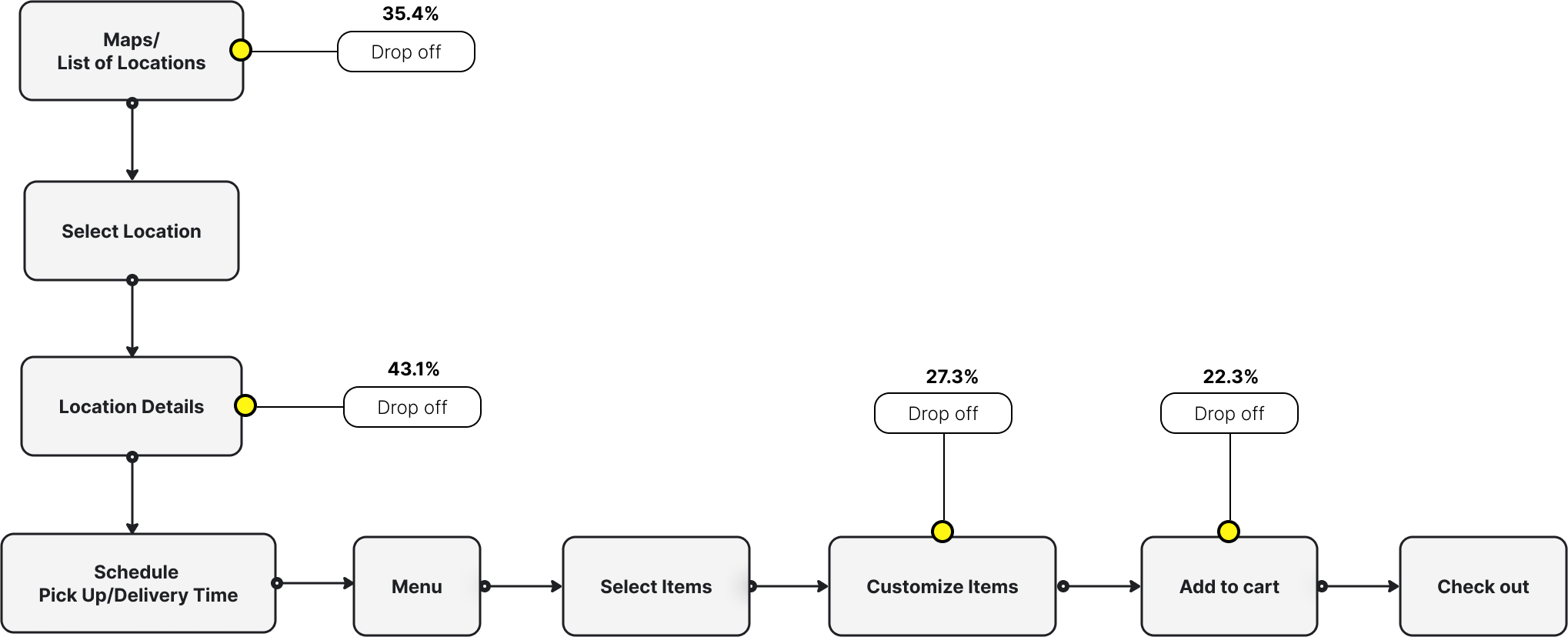
The hardest part of this project is to design the ordering flow because there are a lot of important touchpoints that could happen during the customers journey while placing the orders: looking for the correct locations, browsing the menu, customizing their orders based on their personal preferences, especially when it comes to making their own bowl…
And we don't want to overwhelm or have them lost among the steps. To achieve the goal above, we explore a few options:

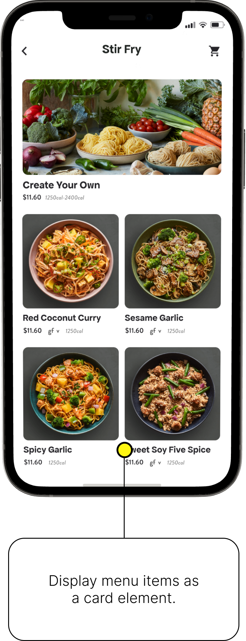
Option 1 - Use card elements to display menu items & Step-by-step wizard
Option 2 - Display Menu Item with no background & Automatically pop-upped upsell screens

Option 3 - A hybrid of concept A & B
The winning concept is concept C, a hybrid concept because a mix of using card elements and no background images could help highlight Seasonal & CYO items while keeping the simplicity of the rest of the menu.
BUSINESS IMPACTS
Both the client and we agreed to set the success based on 3 metrics: Conversion rates, Order Placements, and Customer Satisfaction. We soft-launched the app for a week and received a good amount of feedback from the customers.
Our enhanced ordering experience, focused on streamlined ingredient selection and improved order history visibility, has resulted in 10% increase in conversion rate and 15 % increase on order placement.